.png)

.png)
.png)

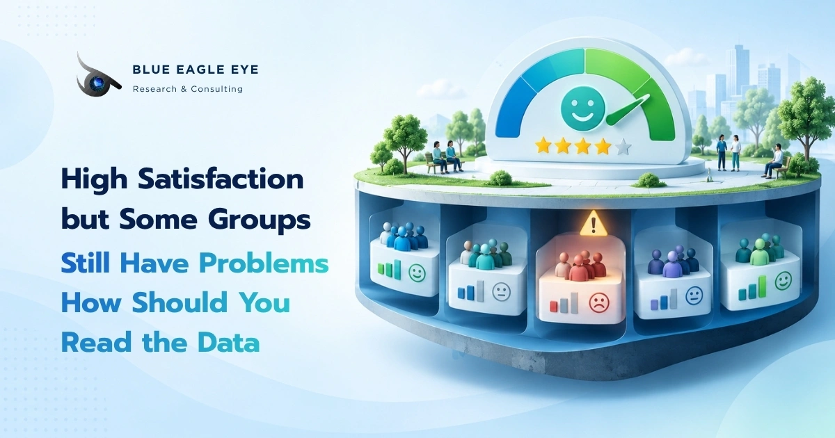
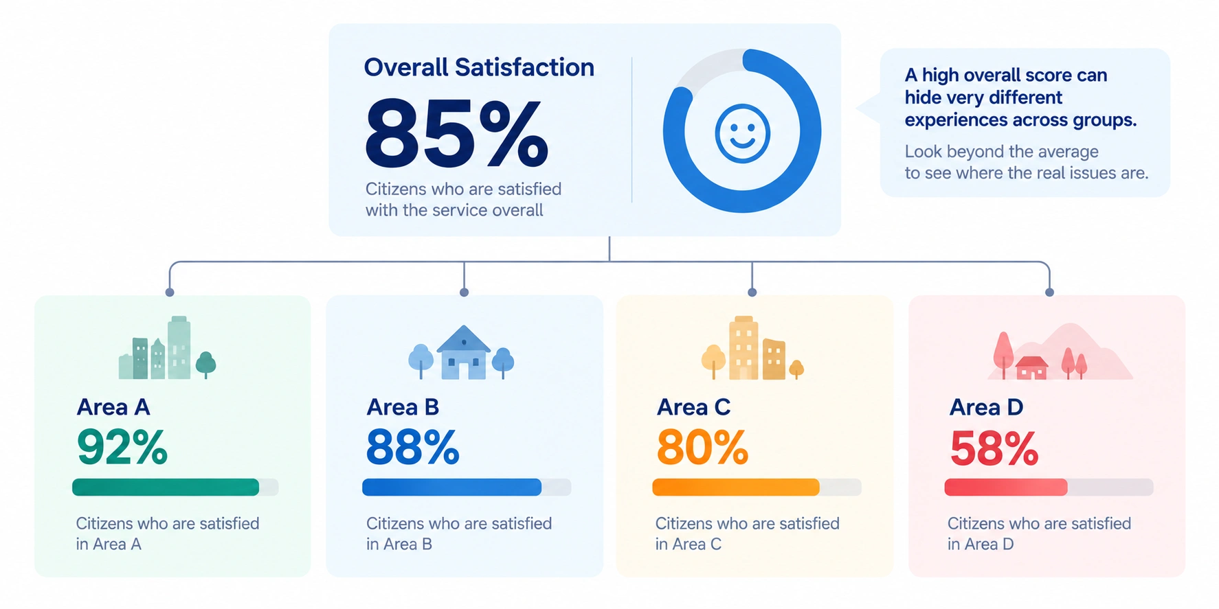
A Satisfaction score of 85% sounds strong. But what if one group reports 92% while another reports only 60%?
The problem with an average is not that it is wrong. It is that one number compresses many different experiences. For public services designed to reach diverse populations, Total Satisfaction should therefore be the beginning of the analysis, not the end.
The short answer is: do not stop at Total Satisfaction.
An average score or overall percentage tells us what the big picture looks like. It does not tell us whether every group is having the same experience. A service may achieve a strong overall score while people in a particular location, channel or population group continue to face significant Pain Points.
The OECD has noted that differences in public-service Satisfaction across population groups may indicate differences in Accessibility, Timeliness or Quality. Disaggregated data can therefore help identify opportunities for service improvement. Government at a Glance 2023, using primarily 2021 OECD Trust Survey data for this analysis, demonstrated meaningful differences in public-service Satisfaction across age, gender and education groups in several countries.
When the overall score looks good, the next question should therefore not simply be “Did we hit the KPI?” It should be “Whose experience may not be improving with the average?”
The average shows the overall picture, not whether everyone has the same experience
Total Satisfaction is useful for tracking the overall picture and trends, but a high average can coexist with serious problems affecting particular groups. Good analysis asks at least four questions: Who sits behind the overall score? Which groups differ from the average? How large and reliable are those gaps? And how many people are affected? Segmentation should start from a Decision Question rather than every variable available, and very small subgroup samples should not be treated as precise evidence.
A high average is not wrong, but it can hide something important
Imagine a public service reporting 85% Satisfaction.
That figure could combine a large group reporting 90% Satisfaction with a smaller group reporting only 55%. Because the first group is much larger, the Total Score can still look strong.
The average is not giving the wrong answer. It is answering a different question.
The Total Score answers: “How satisfied is the population overall?”
Subgroup Analysis asks: “Whose experience differs from the overall picture?”
When a decision involves accessibility, equity or targeted service improvement, the second question may be more useful than the overall average.
The UN metadata for SDG Indicator 16.6.2, which measures Satisfaction with people’s last experience of public services, warns that national aggregates may conceal important subnational variation. Its methodology identifies Income, Sex and Place of Residence as important categories for disaggregating results when the data support such analysis.
Which groups should you analyse?
Do not begin by splitting the dataset by every variable available and then searching for differences.
Begin with the question: “Which differences would matter to the decision we need to make?”
Location or service site
If provinces, districts or branches differ in workload, processes, resources or demand, analysing Satisfaction by location can help distinguish a local problem from a system-wide one.
A lower regional score, however, does not automatically prove that the local team is performing poorly. Differences might also reflect case complexity, user volume, infrastructure or the composition of the population using the service.
Service channel
Online services, Call Centres and face-to-face channels can create very different experiences.
If Total Satisfaction is high but Digital Service users report much lower scores, combining every channel into one figure can allow the stronger performance of other channels to hide a Digital Pain Point.
Channel-level analysis becomes particularly useful when the organisation is deciding where to improve the Service Journey.
Population groups with different needs or circumstances
Age, income, location, Digital Access or other relevant user characteristics may be associated with different levels of access and experience.
The OECD notes that Satisfaction differences between Socio-demographic Groups can serve as diagnostic evidence of possible differences in accessibility, timeliness or quality. These patterns need to be interpreted in the context of the Population and survey design rather than assumed to apply universally across countries or services.
Service type or Life Event
The same person may have an excellent experience with one service and serious difficulties with another.
The OECD Survey on Drivers of Trust in Public Institutions 2025, published in 2026, reports relatively high overall Satisfaction with administrative services while also showing substantial differences by type of experience, or Life Event, and across countries.
If an organisation provides several services, one Overall Satisfaction score may therefore be insufficient for managing individual Service Journeys.
Look beyond the average to the distribution
Imagine two services that both receive an average Satisfaction score of 8 out of 10.
In Service A, most users may give scores close to 8.
In Service B, half may score the service 10 while the other half score it 6.
The average is identical, but the decision implications are different.
Where the data allow, examine additional measures such as:
- Percentage Satisfied and Dissatisfied
- Distribution of responses
- Share giving particularly low ratings
- Median or other summary measures when appropriate
- Differences between relevant groups
- Trend relative to previous waves
The Distribution tells you whether the overall result reflects a relatively consistent experience or an average of people having very different experiences.
Should a 5-point gap and a 20-point gap be interpreted the same way?
No. Finding a difference is not enough. The size of the difference matters.
For example, Satisfaction of 84% versus 82% represents a difference of 2 Percentage Points. Satisfaction of 88% versus 61% represents a difference of 27 Percentage Points.
Both are differences, but their decision significance may be very different.
At least three issues should be considered together:
- Size of the difference, or Effect Size
- Uncertainty around each estimate, which depends partly on Sample Size and Sampling Design
- Business or Policy Significance of the difference
Statistical Significance is not automatically the same as Practical Significance. At the same time, a large-looking gap based on a very small Subgroup may still be highly uncertain.
Be careful with small subgroup samples
Suppose the overall result is based on 2,000 respondents, but the group attracting attention contains only 18 people.
If 10 of those 18 respondents are satisfied, the group result is roughly 56%. Treating that percentage as though it has the same precision as a group containing several hundred respondents would be misleading.
Before reporting subgroup results, check:
- Base or actual number of respondents
- Sampling Method
- Weighting, where relevant
- Confidence Interval or other measures of uncertainty where appropriate
- Non-response and Coverage
- Number of comparisons being made
If the Base is too small, options can include pooling multiple waves, increasing the Sample in future research, combining substantively similar groups, or clearly reporting that the evidence is currently insufficient.
A small group is not necessarily an unimportant group
There is another risk in focusing only on size.
A group containing fewer people is not automatically a lower priority.
If a service is expected to reach everyone, or if a particular group faces unusually high barriers, dismissing the issue because “there are not many people in that group” may overlook an important Equity or Accessibility problem.
The better questions are:
- Who is this group?
- How severe is the problem?
- Is the service expected to reach this population?
- Does the issue affect an important right, opportunity or Outcome?
- Does the pattern persist across waves?
The OECD notes that differences in Satisfaction across groups may signal inequalities in accessibility, timeliness or quality and can be used as a diagnostic signal for further investigation.
If Total Satisfaction is high but one group is low, should that group automatically become the first priority?
Not yet.
A Satisfaction Gap tells us that there is a difference worth investigating. It does not automatically tell us why the gap exists or what should be fixed first.
Suppose older citizens report lower Satisfaction than other groups. The next step is not necessarily to launch a new programme for older citizens. First identify where their experience differs.
Possible explanations might include:
- Difficulty finding information
- Digital Access barriers
- Complex processes
- Waiting Time
- Documents or language that are difficult to understand
- Service channels that do not fit their needs
- Low First-contact Resolution
Journey Analysis, Open-ended Feedback, Operational Data, Qualitative Interviews or Driver Analysis can then help diagnose the pattern.
The OECD’s 2026 report, based on its 2025 survey wave, found that perceived Speed and Ease of Access were strongly associated with Overall Satisfaction among recent users of administrative services. The OECD also cautions against treating these statistical associations as automatic proof of causation.
A Subgroup Gap should therefore start a Diagnosis rather than end the analysis.
Avoid segmenting the data until every group becomes too small to interpret
A dataset may allow almost endless combinations: Age × Gender × Province × Channel × Service Type × Income.
The more slices we create, the smaller each Subgroup becomes and the greater the risk of interpreting random sample variation as a meaningful pattern.
Decision-oriented Segmentation should have a reason before the analysis begins.
Ask:
- Does this group follow a meaningfully different Journey?
- Does it use a different Channel?
- Can the organisation take a different Action for this group?
- Is the segmentation linked to a Policy or Service Objective?
If there is no clear explanation of how a segment could change a decision, adding another subgroup may create dashboard complexity rather than Insight.
A useful dashboard should show both the headline and the groups that need attention
A dashboard displaying only “Total Satisfaction: 85%” can hide useful signals.
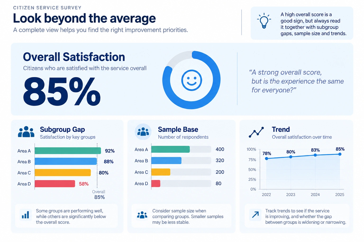
A more decision-oriented view might include:
- Total Satisfaction
- Trend from previous waves
- Satisfaction among priority groups
- Gap versus Total or Benchmark
- Sample Base for each group
- Relevant Outcome or Operational KPIs
- Indicators highlighting groups requiring further investigation
Not every segment needs to appear on the main page. Show the groups that matter to the current Decision Question and allow Drill Down where more detail is needed.
Image suggestion: Insert one Dashboard Concept showing Total Satisfaction at the top and “Subgroup Gap”, “Sample Base” and “Trend” below it, demonstrating that an overall score should always be read with context.
A five-step approach to reading Satisfaction data
- Start with the Total Score to understand the overall picture.
- Check the Distribution and Trend to understand how that result was formed and whether it is changing.
- Break down the data according to the Decision Question, such as Area, Channel, Service Type or Relevant Population Group.
- Check the Base, Sampling and uncertainty before deciding that a Subgroup Gap is meaningful.
- When a Gap appears, diagnose it using Experience Data, Operational Data or additional Research before selecting an Action.
This approach helps avoid two common mistakes: “The overall score is high, so there is no problem” and “We found a low-scoring group, so we already know what needs to be fixed.”
The same principle applies to Customer Satisfaction in business
Businesses can also be misled by averages.
Overall Customer Satisfaction may be 90%, while customers purchasing through a Marketplace report only 72%.
Overall NPS may look strong, while new customers experience significantly weaker Onboarding than established customers.
Average branch Sales may be growing while certain branches or Customer Segments are declining.
For an SME, the useful question is therefore not only “Is our average good?” but “Who makes up this average, and which Segment might the headline be hiding?”
This is why Segmentation is not only a tool for building Personas. It is also a basic tool for reading data and making better decisions.
The takeaway: Averages are useful, but they should not speak for everyone
High Satisfaction is positive evidence about the overall picture. It is not proof that every population group receives the same service experience.
Before concluding that a service is performing well, examine who sits behind the Total Score, whether important Subgroup Gaps exist, whether each subgroup has enough evidence to support interpretation, and how important those differences are for Access, Experience or Outcome.
When a group appears to be struggling, do not assume the Satisfaction score explains the cause. Use the gap as a signal to investigate what is happening in the Journey and what additional evidence is needed before choosing an intervention.
An average helps us see the big picture. Better decisions often begin when we look inside that average.

Do not use Total Satisfaction as evidence that all groups receive the same quality of service. Break results down by decision-relevant groups such as location, channel, age, income or user type, check Sample Size and uncertainty, and consider the size of the gap, the number of people affected and the importance of the problem before setting priorities.
Sources
- OECD. Government at a Glance 2023: Satisfaction with public services across population groups. The subgroup analysis primarily uses data from the 2021 OECD Survey on Drivers of Trust in Public Institutions.
- OECD. OECD Survey on Drivers of Trust in Public Institutions 2026 Results. Based on the 2025 survey wave and published in 2026.
- United Nations Statistics Division. Metadata for SDG Indicator 16.6.2: Proportion of population satisfied with their last experience of public services. The methodology identifies Income, Sex and Place of Residence as important disaggregation categories and notes the risk of national aggregates concealing subnational variation.
- OECD. Serving Citizens: Measuring the Performance of Services for a Better User Experience. Published 30 May 2022.

.png)
.png)
.png)